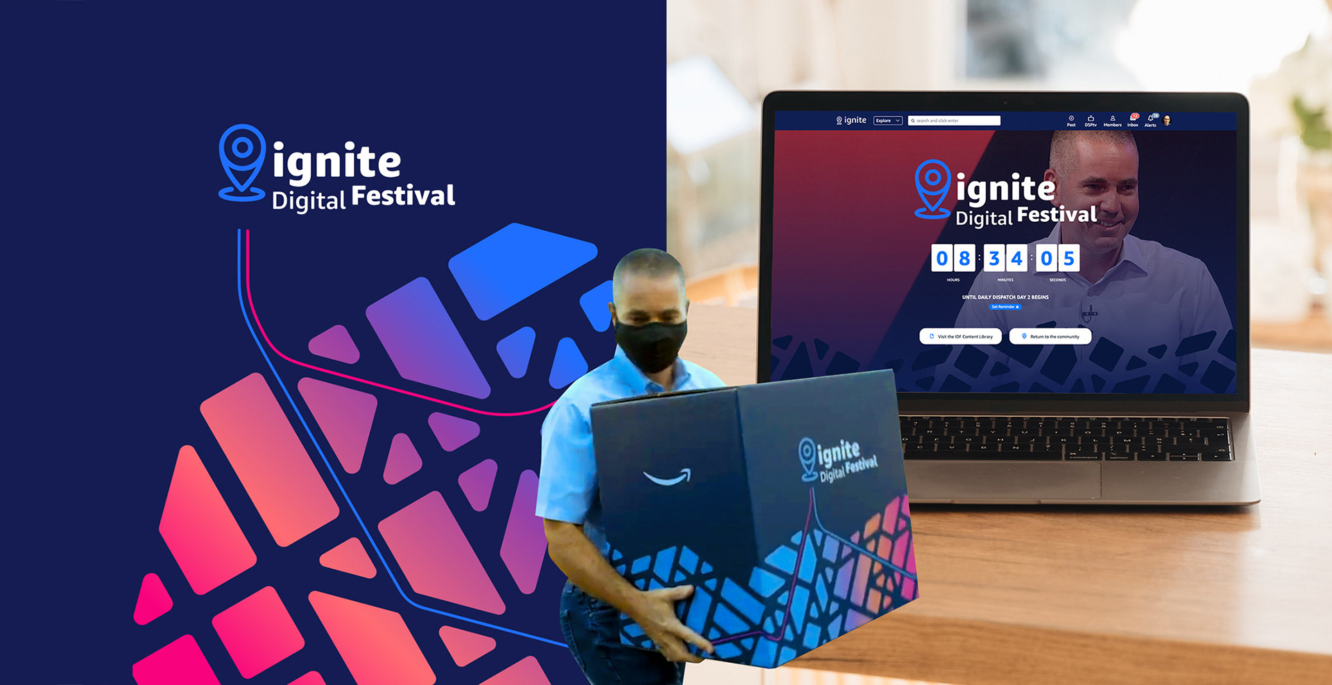
During my time at Amazon, they organised an annual event called Ignite. My role was to reinvent the brand to make it vibrant and create excitement around participating.
After a total rebrand, the event was cancelled due to the Covid lockdown. Leadership then decided to pivot to a virtual event and hired a TV production company for this, but my brand turned out to be perfectly suited to the conversion.

Previous logo

New logo
The first step was to change the logo. The event was renamed "Festival," and since it had been converted into a virtual event, it became the "Digital Festival." The design needed to pivot from a business-like look to something more energetic, festive, and fun — a countermeasure to the gloomy atmosphere Covid had created.
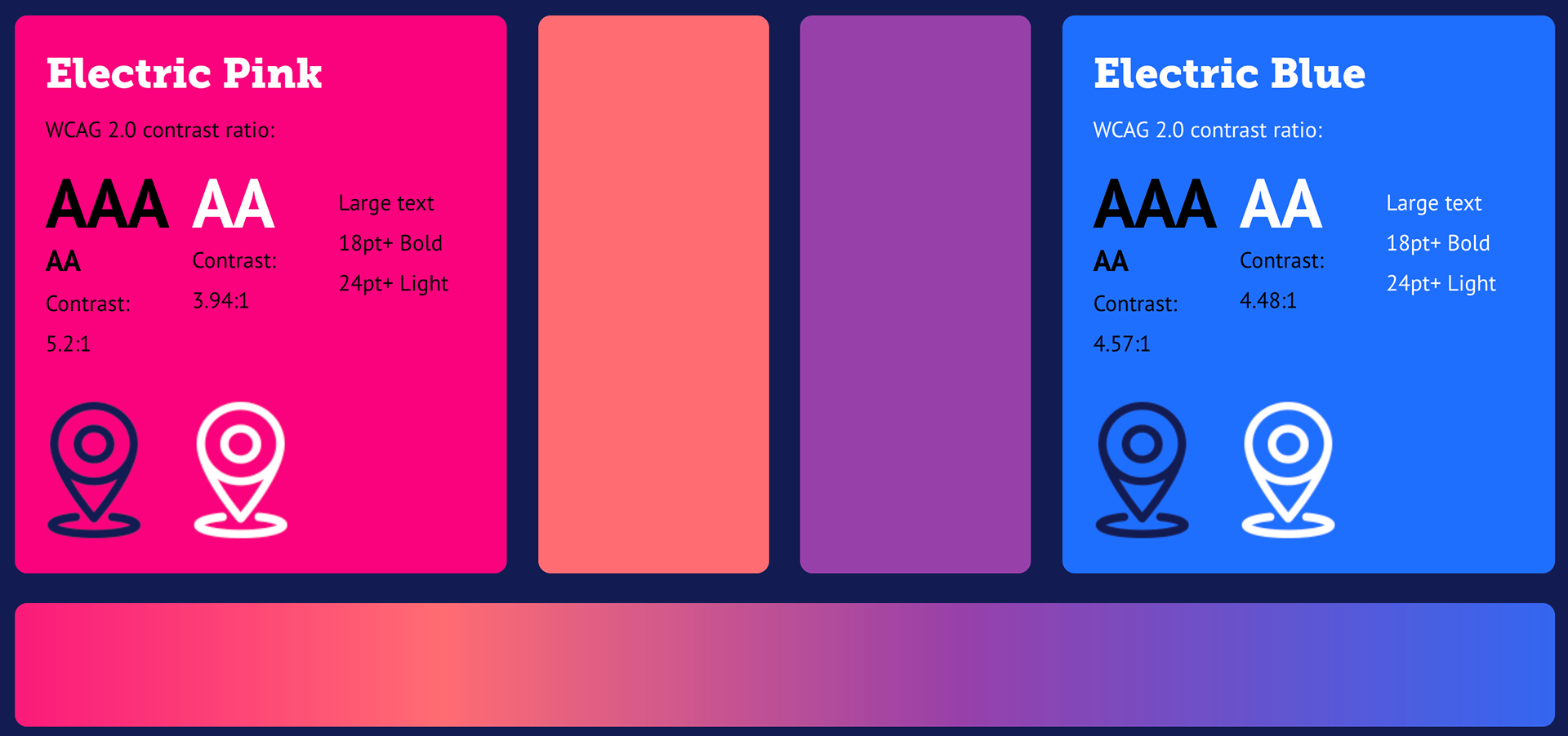
I coloured the mark in electric blue, misaligned all its components, and played with contrasts to give it a maverick look that broke from the past.
The colour scheme was inspired by the poster for the film Cocktail — this needed to look less like a business event and more like a party. Hence the use of bright neon pink and blue, plus the addition of a gradient that connects to other Amazon event designs.
Pattern building module structure

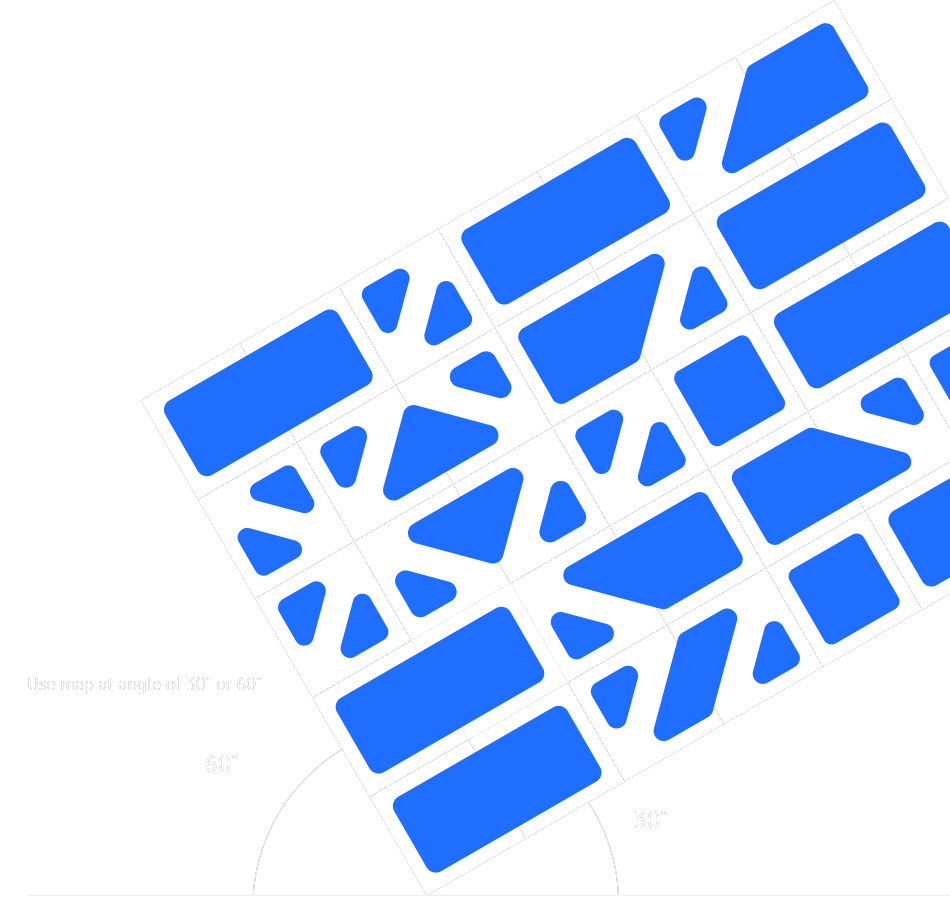
Inspired by the job of the delivery partners, I invented modular pieces that connected randomly or purposefully, create a pattern that remind of a city map. This resulted being a versatile design device what we used everwhere, from the stage design, video assets, to printed collateral.
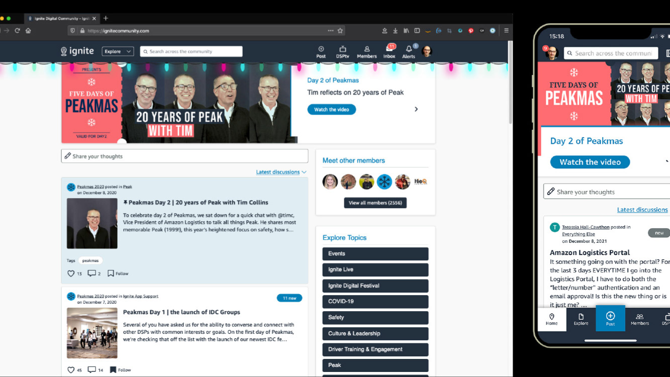
Event screenshots
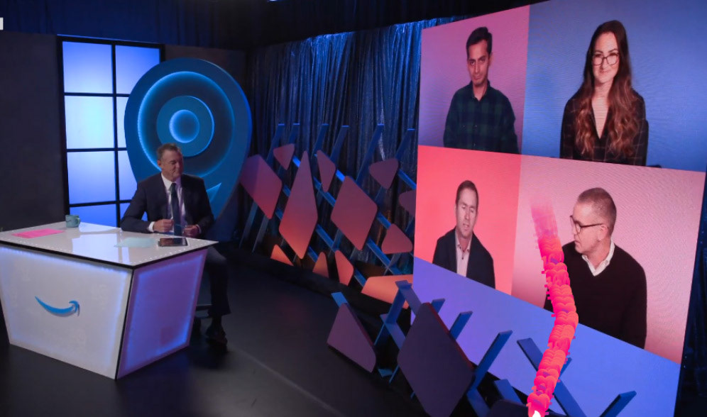
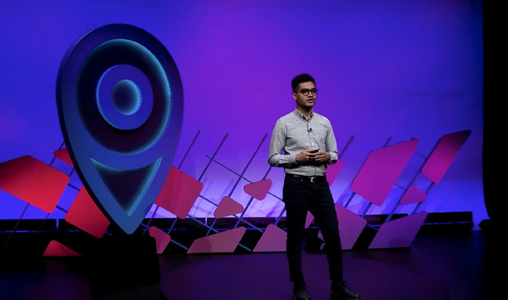
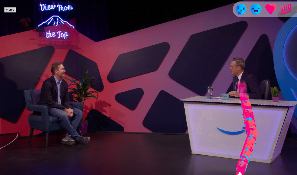
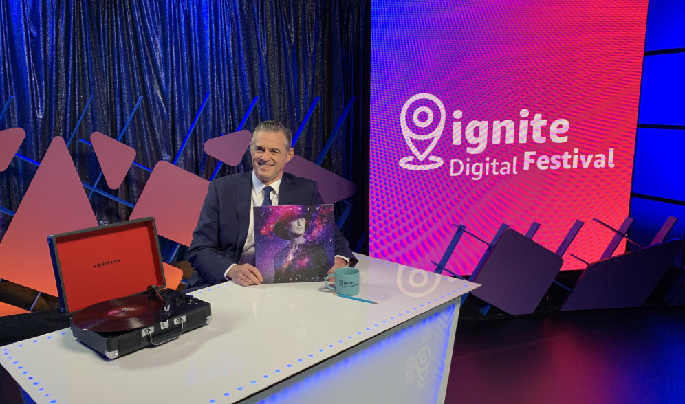
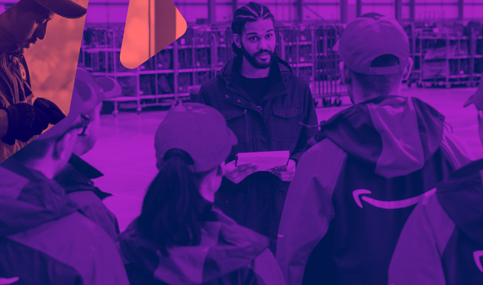
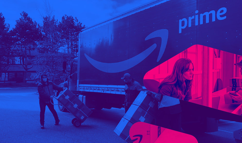
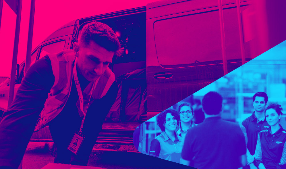
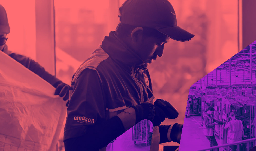
Photo treatment
Event registration platform design
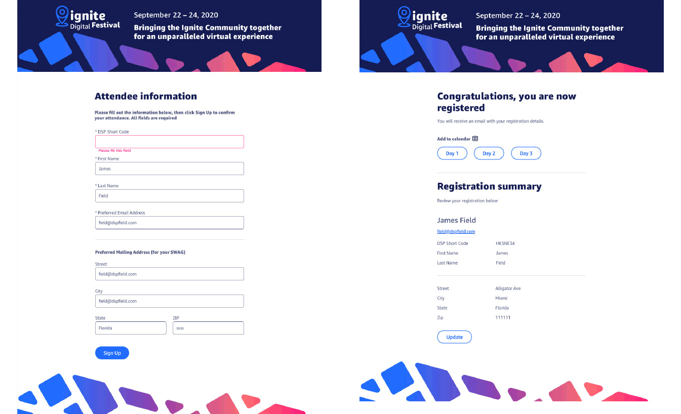
Built in Cvent
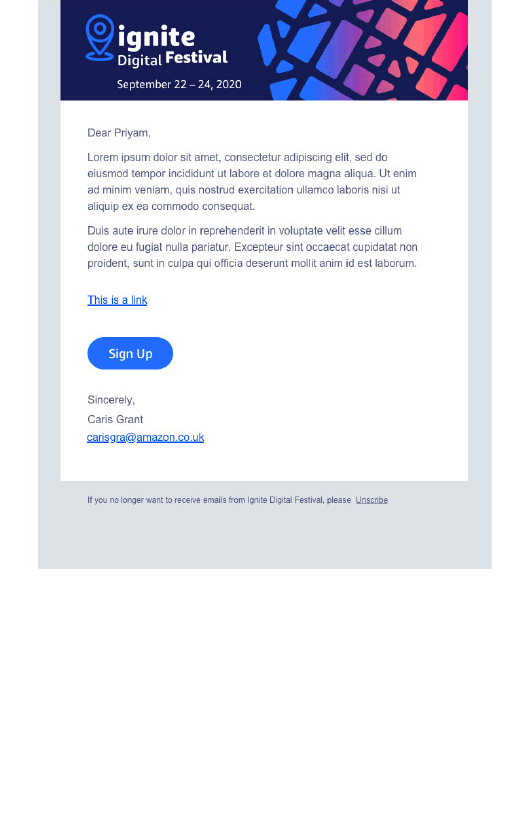
Email template
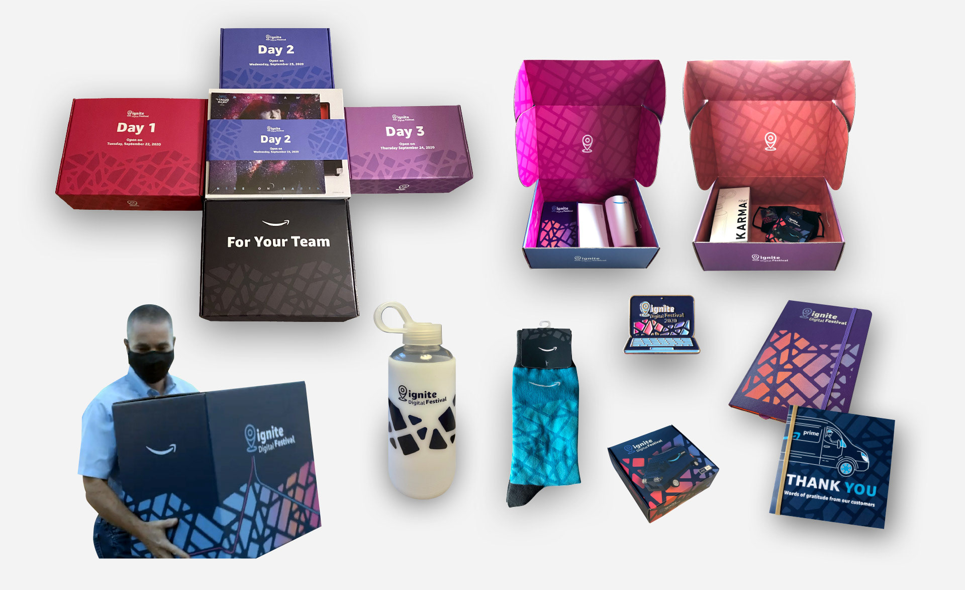
Swag